|
Using Microsoft Excel to Make Scatter Plots
by Mark
 Paczkowski - 2004 Paczkowski - 2004 |
|
1. After opening Microsoft Excel, you will see columns and rows.
2. Enter your x-axis data in the first column.
3. Enter y-axis data in the next column.
4. Select (highlight) both your x and y data. |
|
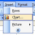
5. Go up to Insert, then "Chart…" to open chart
wizard. |
 |
|
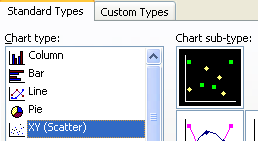
6. Select for "Chart Type", "XY (Scatter)".
7. Next, on Chart sub-type, select the top chart that has no
lines, and click Next.
8. Click Next again. |
 |
|
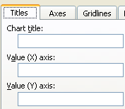
9. Enter the chart title along with your X and Y axes
labels. (put units in parenthesis)
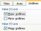
9a. Select Gridlines tab
9b. Select Major Gridlines on both axis
|
 |
 |
|
10. Click Next.
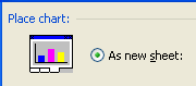
11. Click on
"As new sheet" and click
Finish.
|
 |
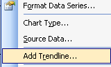
12.
Right click on any data point -
this should highlight all the data points
and select "Add Trendline…"
|
 |
13. Select
"Linear" for a line or
"Polynomial" for a curve.
|
| 14. Click
Options tab
and check t he last three check boxes. Select
OK |